The Psychology of Color in Design: What You Need to Know
The Psychology of Color in Design: What You Need to Know
Understanding the psychology of color in design is essential for creating visually appealing and emotionally engaging designs. Colors can evoke emotions, influence perceptions, and even drive actions, making them a powerful tool in the hands of a skilled designer. This article delves into the emotional impact of colors and offers design tips on how to use color effectively in your projects.
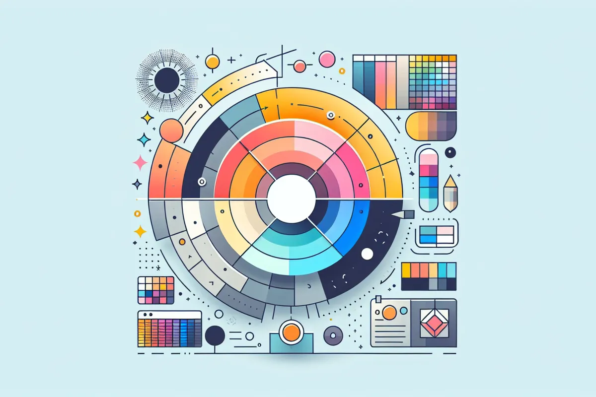
The Basics of Color Psychology in Design
Color psychology in design examines how different hues can affect mood, behavior, and feelings. This area of design psychology is rooted in color theory, which explores how colors interact and the effects they have on the viewer. Here are some basic principles:
- Warm Colors: Colors like red, orange, and yellow are known to evoke feelings of warmth and positivity. They can stimulate excitement and energy.
- Cool Colors: Colors such as blue, green, and purple tend to have a calming effect and are often associated with serenity and professionalism.
- Neutral Colors: Black, white, and gray serve as balancing elements and can enhance the impact of other colors in a design.
Design Best Practices for Using Color
To harness the full potential of colors, designers should adhere to certain best practices. Here are some effective color combinations and visual design tips:
- Understand Your Audience: Different demographics may perceive colors differently. Tailor your color choices to the cultural and individual preferences of your target audience.
- Maintain Consistency: Use a consistent color palette to establish a strong brand identity and ensure a cohesive design.
- Limit Your Palette: Too many colors can overwhelm the viewer. Stick to a limited palette to maintain focus and clarity in your design.
- Experiment with Contrast: Use contrast to draw attention to key elements and make your design more dynamic.
Designing for Emotions with Color
The emotional impact of colors can be leveraged to create designs that connect with audiences on a deeper level. Here are some tips on how to use color in design to evoke specific emotions:
- Red for Urgency: Red can be used to create a sense of urgency or excitement, making it perfect for call-to-action buttons.
- Blue for Trust: Blue is often associated with trust and reliability, making it ideal for corporate or financial sectors.
- Green for Growth: Green is linked to growth and health and is commonly used by brands focused on sustainability.
Mouad Zizi's Design Expertise
Drawing on years of experience, Mouad Zizi offers expert insights into how to effectively use color in design. His expertise in design psychology ensures that projects are not only visually stunning but also emotionally resonant. By considering the emotional impact of colors and implementing design best practices, designers can create compelling and persuasive visual experiences.
If you like to build a project, I offer this service. You can check my services or products and feel free to contact me.